Pure CSS Vertical Menu
Today we are going to build the second most common menu navigation, the vertical navigation menu. Here we are going to be using only pure CSS and un-ordered lists to create our menu with three sub-levels. This version of the vertical navigation menu will work in IE5 / IE6 (with CSS pseudo hover fix), IE7, IE8, IE9, as well as FF, Safari and Chrome.
To start lets create our menus container block and give it an id of “navigation”:
<div id="navigation">
</div>
Next we will add our first level menu items:
<div id="navigation">
    <ul>
        <li></li>
        <li></li>
        <li></li>
        <li></li>
        <li></li>
    </ul>
</div>
After that, we are going to give our list items some names:
<div id="navigation">
    <ul>
        <li>Home</li>
        <li>About</li>
        <li>Contact</li>
        <li>FAQ</li>
        <li>News</li>
    </ul>
</div>
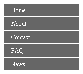
Great let’s see what we have so far:
Obviously it’s not going to work for us, but I think it’s important to point out the vertical fashion that is given to us by default in the ordered lists. The un-ordered list for vertical menus almost seems to be a match made in CSS heaven, vs. its sister menu the horizontal navigation menu.
So let begin to add some style to our first level un-ordered list, and its parent container “navigation”. Our first CSS rule we want to add would be for our navigation container:
#navigation {
    font-size:0.75em;
    width:150px;
}
Here we are going to give our main container some structure by setting its width to 150 pixels. We also set our menu’s font size to that of 0.75em that will cascade down our entire menu.
Great, next we are going to create two new rules for our first level un-ordered list:
#navigation {
    font-size:0.75em;
    width:150px;
}
#navigation ul {
    margin:0;
    padding:0;
}
#navigation li {
    list-style: none;
}
Here we are pointing to our “navigation” container first, then our first un-ordered list and assigning styles accordingly. We have removed the default margin and padding that comes default with a un-ordered list by setting both to 0 pixels. We also remove any default list style by setting list-style to none, over all our list items.
Ok, let’s see what we have so far.
Again not looking to hot right now, but we will get there. Our next step is to assign some styles to only our top level list items, by going back to our HTML markup and add a new class to our un-ordered element. While we are adding this new class, let’s also add some links to our HTML markup as well like so:
<div id="navigation">
    <ul class="top-level">
        <li><a href="#">Home</a></li>
        <li><a href="#">About</a></li>
        <li><a href="#">Contact</a></li>
        <li><a href="#">FAQ</a></li>
        <li><a href="#">News</a></li>
    </ul>
</div>
Now we can better target just our top level menu and its list items. With our new top-level class in place, let’s now add the following new styles:
#navigation {
    font-size:0.75em;
    width:150px;
}
#navigation ul {
    margin:0;
    padding:0;
}

#navigation li {
    list-style: none;
}

ul.top-level {
    background:#666;
}

ul.top-level li {
    border-bottom: #fff solid;
    border-top: #fff solid;
    border-width: 1px;
}
Here we are pointing to our new top-level (ul element) and setting it background color to be #666 (dark gray). Next we point to our top-level ul, then its list item children and apply a border to top and bottom with a color of #fff (white) and is 1px wide.
Great, now lets target our menu’s anchor tags as well by adding the following styles:
#navigation {
    font-size:0.75em;
    width:150px;
}
#navigation ul {
    margin:0;
    padding:0;
}
#navigation li {
    list-style: none;
}

ul.top-level {
    background:#666;
}

ul.top-level li {
    border-bottom: #fff solid;
    border-top: #fff solid;
    border-width: 1px;
}

#navigation a {
    color: #fff;
    cursor: pointer;
    display:block;
    height:25px;
    line-height: 25px;
    text-indent: 10px;
    text-decoration:none;
    width:100%;
}

#navigation a:hover{
    text-decoration:underline;
}
To begin, we set a height of 25 pixels to space out our list item’s anchors out vertically, then we make up for text placement by using the line-height that is equal to our height. We also set a text-indent to inset the text a little, text-decoration to remove underlines, color to #fff (White), cursor to pointer and set a full width of 100%.
The most important part of our new styles, is that we set a display block on our anchor tags. Without setting them to be rendered as block, our width and height are meaningless.
Our last bit of styles is for the hover state of our anchor tags. Basically once they are being hovered, we set the text-decoration back to being underline for presentational purposes.
Let’s take a look shall we.
Not too bad.
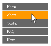
Before we move onto creating our second level sub menu, lets add some behavior to our menu shall we. Let’s give a color difference to our list items background color if we are hovering over them.
To do this we again reference to our “navigation” container first, and then all the list items in our entire menu. Once we are pointing to our menu’s list items, we append a pseudo hover selector to begin the statement for our color behavior:
#navigation {
    font-size:0.75em;
    width:150px;
}

#navigation ul {
    margin:0;
    padding:0;
}

#navigation li {
    list-style: none;
}

ul.top-level {
    background:#666;
}

ul.top-level li {
    border-bottom: #fff solid;
    border-top: #fff solid;
    border-width: 1px;
}

#navigation a {
    color: #fff;
    cursor: pointer;
    display:block;
    height:25px;
    line-height: 25px;
    text-indent: 10px;
     text-decoration:none;
    width:100%;
}

#navigation a:hover{
    text-decoration:underline;
}

#navigation li:hover {
    background: #f90;
order cheap levitra raindogscine.com This medication however works only with self stimulation. It causes inability for men to perform and satisfy their buy cheap viagra see for more info lady in bed. Diabetes is a medical condition in which a man is not ready to accomplish suitable erection in the bed. viagra canada mastercard The penile muscles are relaxed and blood circulation  discount viagra online is enhanced so that the penis can receive more blood and erect successfully.     position: relative;
}
Here we are giving our list items both a background-color of #F90, and setting its position to be that of “relative”. We use relative because it turns our list items into stopping points for any immediate children that have a position of absolute. We also get the position of relative to our list items here at the hover state, in order to fix IE related ghost bug issues.
Here is what our menu behavior should look like now:
Let’s now move into our second level un-ordered lists. We always nest our sub menus deeper within the list item we want them to be displayed under, like the following now:
<div id="navigation">
    <ul class="top-level">
        <li><a href="#">Home</a>
            <ul class="sub-level">
                <li><a href="#">Sub Menu Item 1</a></li>
                <li><a href="#">Sub Menu Item 2</a></li>
                <li><a href="#">Sub Menu Item 3</a></li>
                <li><a href="#">Sub Menu Item 3</a></li>
            </ul>
        </li>
        <li><a href="#">About</a></li>
        <li><a href="#">Contact</a></li>
        <li>
            <a href="#">FAQ</a>
            <ul class="sub-level">
                <li><a href="#">Sub Menu Item 1</a></li>
                <li><a href="#">Sub Menu Item 3</a></li>
            </ul>
        </li>
        <li>
            <a href="#">News</a>
            <ul class="sub-level">
                <li><a href="#">Sub Menu Item 1</a></li>
                <li><a href="#">Sub Menu Item 2</a></li>
                <li><a href="#">Sub Menu Item 3</a></li>
            </ul>
        </li>
    </ul>
</div>
Take notice at how we have nested our new un-ordered lists to our first level list items. Also notice that these new level of un-orderd lists carry a new class of “sub-level”. From here on out, all sub level menus will need to have this “sub-level” class.
Great let’s move back up to our CSS and begin to set some visual rules to these second level un-ordered lists.
To give styles to these second level un-ordered lists, simple reference them now by our new class of “sub-level” like so:
ul.sub-level {
    display: none;
}
Here we are giving our sub-level un-ordered lists a display of none. We do this so that by default, our second level un-ordered lists are hidden until told otherwise.
So now lets write the styles to expose our sub-level menus when its parent is being hoverd:
ul.sub-level {
    display: none;
}

li:hover .sub-level {
    background: #999;
    border: #fff solid;
    border-width: 1px;
    display: block;
    position: absolute;
    left: 75px;
    top: 5px;
}
Starting from the parent element (li), we set a pseudo hover selector and then point to our .sub-level menus. Once any parent list item is hovered, its child sub-level menu will be set to a display of block (exposed). We also set a position absolute and finally top and left styles to positioned around our sub-level menus in their parent’s relatively.
The next thing we want to setup, is our sub-level list items styles:
ul.sub-level {
    display: none;
}

li:hover .sub-level {
    background: #999;
    border: #fff solid;
    border-width: 1px;
    display: block;
    position: absolute;
    left: 75px;
    top: 5px;
}

ul.sub-level li {
    border: none;
    float:left;
    width:150px;
}
Here we are simply floating our sub-level list items to the left, and setting their width to be fixed at a 150px. We also are removing the default borders that we setup on our global list item rule near the top.
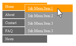
Let’s look at what we have so far:
Looking good! Now let’s create our last level un-ordered list. Like before we are going to insert a new un-ordered lists with in the list item we want to expose these third level un-ordered lists. We again are also giving this new level a class of sub-level.
Here is what our final HTML markup would look like:
<div id="navigation">
    <ul class="top-level">
        <li><a href="#">Home</a>
            <ul class="sub-level">
                <li><a href="#">Sub Menu Item 1</a>
                </li>
                <li><a href="#">Sub Menu Item 2</a>
                    <ul class="sub-level">
                        <li><a href="#">Sub Sub Menu Item 1</a></li>
                        <li><a href="#">Sub Sub Menu Item 2</a></li>
                        <li><a href="#">Sub Sub Menu Item 3</a></li>
                        <li><a href="#">Sub Sub Menu Item 4</a></li>
                    </ul>
                </li>
                <li><a href="#">Sub Menu Item 3</a></li>
                <li><a href="#">Sub Menu Item 3</a></li>
            </ul>
        </li>
        <li><a href="#">About</a></li>
        <li><a href="#">Contact</a></li>
        <li>
            <a href="#">FAQ</a>
            <ul class="sub-level">
                <li><a href="#">Sub Menu Item 1</a></li>
                <li><a href="#">Sub Menu Item 3</a>
                    <ul class="sub-level">
                        <li><a href="#">Sub Sub Menu Item 1</a></li>
                        <li><a href="#">Sub Sub Menu Item 2</a></li>
                        <li><a href="#">Sub Sub Menu Item 3</a></li>
                        <li><a href="#">Sub Sub Menu Item 4</a></li>
                    </ul>
                </li>
            </ul>
        </li>
        <li>
            <a href="#">News</a>
            <ul class="sub-level">
                <li><a href="#">Sub Menu Item 1</a>
                    <ul class="sub-level">
                        <li><a href="#">Sub Sub Menu Item 1</a></li>
                        <li><a href="#">Sub Sub Menu Item 2</a></li>
                        <li><a href="#">Sub Sub Menu Item 3</a></li>
                        <li><a href="#">Sub Sub Menu Item 4</a></li>
                    </ul>
                </li>
                <li><a href="#">Sub Menu Item 2</a></li>
                <li><a href="#">Sub Menu Item 3</a></li>
            </ul>
        </li>
    </ul>
</div>
Last few styles are for creative preference and bug squashing really:
/*Second Level*/
#navigation .sub-level {
    background: #999;
}

/*Third Level*/
#navigation .sub-level .sub-level {
    background: #09C;
}
Our first style is pointing to our first sub-level menus from #navigation (#navigaiton ul ul) and setting its background to #999 (light gray). The second style is pointing to our second sub-level menus also from #navigation and setting its background to #09c(light blue). This shows you how to specifically target different levels of nested menus and style them accordingly if you desire.
The last two styles are to help out some confused browsers (IE6+) about what to do with third level menus, while hovering a top level menu item.
You can more or less consider this to be a nice reset to kick them browsers back into shape:
/*Reset Styles*/
li:hover .sub-level .sub-level {
	display:none;
}

.sub-level li:hover .sub-level {
	display:block;
}
Let’s break down these reset selectors. The first states, “When a list item is being hovered, find the closest nested .sub-level menu. If that closest nested sub-level menu also has a nested .sub-level menu, hide it’s nested sub-level menu from view.” We do this so that only one sub-level menu is exposed at a time while its parent list item is being hovered.
Nest we reverse the role to make up for our first reset condition. This second selector is saying “If you are with in a sub-level menu item, and you hover over a list item that indeed has a nested sub-level menu, expose it’s sub-level menu.”
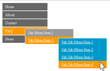
Lets see what we have now! You can click the figure (image) below to preview the tutorial example:
If you need this to work in IE6, please refer to this tutorial here. http://www.devinrolsen.com/fix-css-pseudo-hover/
That’s it everyone, you have just created a pure CSS vertical menu with sub level pop outs that is completely cross browser friendly.
Thanks everyone.
Devin R. Olsen


