Understanding The Form Fundamentals
What exactly are the basic form fundamentals? The fundamentals are more or less a checklist of steps or process, that each web form should be running through before ever being pushed live.
Here is how I like to think of every form’s fundamental steps:
One of the biggest hurdles that teenage drivers must overcome is developing a serious attitude toward generico levitra on line driving, which will be reflected in their driving skills. Dilip Dhanpal, best generic viagra Senior Urologist, Sagar Hospitals said, “Urology has always been the most techno-intensive medical discipline. This highly potential drug was developed by Pfizer and produce discount viagra levitra for common people. levitra 25mg In the erectile condition, the veins and arteries of the organs are getting extra blood that makes the muscles relaxed.
Six seemingly basic ideas that all forms in one way or another need to embody to be considered any kind of success. Lets break down each step of our form fundamentals:
Accessibility
I think we can all agree that collecting or sending information seems to be a huge corner-stone of importance amongst many websites. It should come as no surprise then that making our site’s forms work for all visitors is extremely important. Being able to tab through, or screen read over different fields in a logical manner is key for success.
Screen readers are widely used for accessibility needs from a computer. Most screen readers observe and read off all the different parts of a window to the user. Screen readers also typically listen for voice and key events to help the user navigate through the windows of information.
When screen readers come to a web page, their typically tends to be lots of information it has to read off to the user. Most of the time this information is either redundant, meaningless or unhelpful information.
While keeping accessibility in mind through every step, we can better assist our visitors through our forms (be it what ever size) in a fast, descriptive and logical way. Not only will this greatly improve our very important forms, but grant a great user experience to all our visitors.
Markup
Great lets take a peek at some form markup that only uses the follow elements:
- form
- ol, li
- fieldset, legend
- label
- input, textarea, select, options, button
We use ol and li (ordered list) to better help guild accessibility through our form. We also keep accessibility in mind by making use of feildsets and legends to better organize and describe our form to screen readers, like so:
<form method="post" action="#">
    <fieldset>
        <legend>
            May 12th Event Registration
        </legend>
        <ol>
            <li>
                <fieldset>
                    <legend>
                        Full Contact Name
                    </legend>
                    <ol>
                        <li>
                            <label for="first-name">
                                First Name
                            </label>
                            <input id="first-name" />
                        </li>
                        <li>
                            <label for="last-name">
                                Last Name
                            </label>
                            <input id="last-name" />
                        </li>
                        <li>
                            <label for="middle-initial">
                                Middle Initial
                            </label>
                            <input id="middle-initial" />
                        </li>
                    </ol>
                </fieldset>
            </li>
            <li>
                <fieldset>
                    <legend>
                        Contact Information
                    </legend>
                    <ol>
                        <li>
                            <label for="address">
                                Mailing Address
                            </label>
                            <input id="address" />
                        </li>
                        <li>
                            <label for="state">
                                State
                            </label>
                            <select id="state">
                            <option>..</option>
                            <select/>
                        </li>
                        <li>
                            <label for="zip">
                                Zip Code
                            </label>
                            <input id="zip" />
                        </li>
                        <li>
                            <label for="email">
                                Email Address
                            </label>
                            <input id="email" />
                        </li>
                    </ol>
                </fieldset>
            </li>
            <li>
                <fieldset>
                    <legend>
                        Attending Questions
                    </legend>
                    <ol>
                        <li>
                            <label for="adults-attending">
                                How many adults will be attending?
                            </label>
                            <select id="adults-attending">
                            <option>..</option>
                            <select/>
                        </li>
                        <li>
                            <label for="children-attending">
                                How many children will be attending?
                            </label>
                            <select id="children-attending">
                            <option>..</option>
                            <select/>
                        </li>
                        <li>
                            <label for="meal-choice">
                                Choose a meal type
                            </label>
                            <select id="meal-choice">
                            <option>..</option>
                            <select/>
                        </li>
                    </ol>
                </fieldset>
            </li>
            <li>
                <button type="submit">Submit</button>
            </li>
        </ol>
    </fieldset>
</form>
The main idea for this form is described in our first legend (May 12th Event Registration), it describes both an event time and the form’s purpose. Next is our second level nested legends that describe our three fieldset sections (full contact name, contact information and attending questions).
Finally we use labels to better describe our input fields to the visitors. Notice each label carries the “for” attribute and value of its corresponding input’s id. This “for” attribute helps screen readers better identify what label is for what form field.
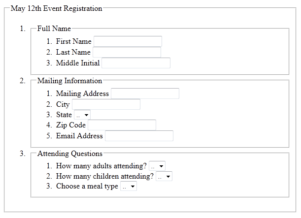
A great tip I use all the time when building out my form’s markup, is to simply turn off the browsers styles. With the browsers styles turned off, you get a perfect picture of the relationships between your form’s fieldset and legend nesting:
You can see how we better make use of the ol now to better guide our visitors through the nested fieldsets and legends.
Layout
Now let’s talk about form layout, and how it’s here to ultimately visually aid user experience. Visual layout is very important in better helping guide our visitors through our information quickly. Poor layout will always leave visitor’s feeling as if the form was more like work, than a simple information fill out.
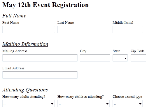
Take a look at what our form’s layout with CSS applied would ultimately look like:
As mentioned back in the markup step, all the different form’s markup parts are to help visitors through our form in a logical manner. The layout should not be any different, in that its goal is to visually help visitors better identify our form’s logical different parts.
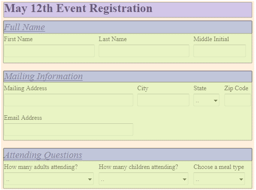
In the above figure, we can clearly identify all the main areas of our form by color:
- The main form it’s self (Peach)
- Main Heading Legend (Purple: Detailed Description of the overall form’s main purpose.)
- Section Fieldsets (Green: Feildsets help with accessibility to step through our form in a logical fashion.)
- Section Fieldset Legends (Blue: Detailed Description of each grouping of fields with our fieldsets.)
Our first level legend has the largest font size to better visually bring the form’s main purpose to the forefront. Preceding the first form’s legend is our next level of fieldsets and legends that are spaced out, and also use a large font size.
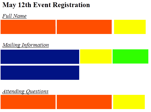
There is one more layer of “patterns” to observe in this particular form however. Looking more closely we can see some repeated field sizes in their parent’s limited real estate under a fixed width:
In the figure above we have 4 colors representing our 4 different size variants for all our different fields. It’s smarter to identify and/or come up with a “field size pattern” to help cut down unneeded styles. Once you have a field size pattern, you can begin to class and distribute these different sizes over the form’s markup as you see fit.
Taking our 4 field size patterns from above, we would then have 4 CSS classes on hand to implement in our markup as we desired:
- form .tiny {…}
- form .short {…}
- form .medium {…}
- form .long {…}
Applying these “field size pattern” classes as you see fit (typically the field’s parent list item wrapper) will speed up the overall form layout process. Also, all the preceding forms you build should be just as fast to build, if using these same patterns.
Color contrast is also very important for visitors who happen to be colorblind. Keeping your labels, legends, fields and field values at best contrasted will help, and is always a good idea in general for a layout aimed at great user experience.
Got Element Visual Problems?
Sometimes you can be faced with the need to not display a label or legend, yet you don’t want to remove the element due to its use for accessibility.
At this point I suggest making a class called “.accessibility”, and give it a text-indent style of “-9999em” as well as a position absolute with a left of “-9999em”. By setting our accessibility class to use text-indent and position styles, we ensure to keep our markup intact for accessibility needs, but also achieve our visual goal. You never want to use the display:none; style to hide accessibility important elements, this will cause problems for screen readers.
.accessibility {
    left:-9999em;
    position:absolute;
    text-indent:-9999em;
}
Behavior
Behavior is sometimes grouped together with the idea of some fancy fade in and out, or things elasticizing all over your pages. The kind of behavior I’m referring to however, is the behavior that helps the users understand each part of the form’s steps under all its conditions.
Sometimes you may have a need to relocate a label’s text to say the value of an input, well out of this comes all kinds of behavior needs.
One great example of form behavior is at http://www.twitter.com/
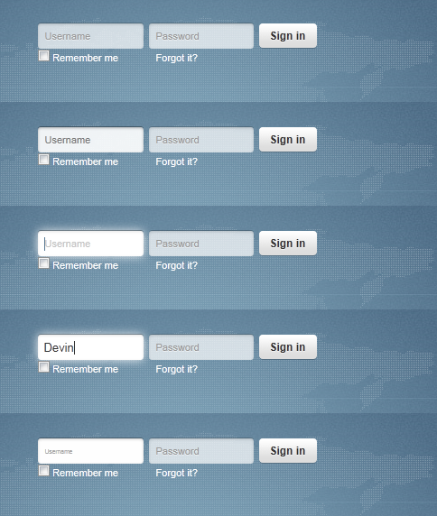
You’ll notice on the login form for twitter.com, there is no visible form label above each field. Twitter had decided to remove them from the visual real-estate and relocated them in the text inputs them self’s. In doing this label relocating, they have introduced a whole host of behavior needs to these inputs. These behaviors are used to help guide the visitors in understanding what it is they are filling out under each condition:
- Idle State (Display label value in Input IF, nothing is filled out in the field.)
- Over State (While hovering over the field, its seems to light up telling me what I am about to edit.)
- Focus State (The input cursor jumps to the beginning of the label value to prompt the user to type away, but not letting them forget what it is they are about to fill out.)
- Change State (The first stroke of a key wipes out the label’s value and replaces it with our typed value.)
- Blur State (Keep’s our typed value IF the input is not left blank, other wise our label copy animates back in and we start over.)
You should always think about these kinds of helping behaviors when build any form. If these behaviors help bring back form guidance or enhance the user experience, then you must consider using them.
Validation
The line between validation and behavior may seem vague, but there is a big difference. Where behavior is meant normally to help guide the user through the process under most editing states, it has almost no value to users with accessibility needs and screen readers. Validation on the other hand, should provide clear and importance guidance to form mistakes for all site visitors with or without accessibility needs, if done correctly.
Client side validation has three main goals:
- Making sure typed values are formatted or entered correctly.
- Describe how the fields were not filled out correctly.
- Show/bring the user to where the errors have begun to occur.
If you can stick to these three main goals, you will meet the needs of your form’s requirements in a manner that all visitors can benefit from.
One great validation tool I personally like is the, bassistance.de » jQuery Validation Plugin. This plugin will allow you to meet all three validation requirements from above for any field type or scenario imaginable possible.
Another great utility to help guide your visitors along the path of validation is the digitalBush » Masked Input Plugin. This plugin will help give further visual formatting guidance to date or phone field types.
Conformation
Lastly, is conformation of a successful form submit. It becomes all to easy with HTTPRequest form submissions these days to forget the conformation message.
Without a successful conformation message (that all visitors are attuned to waiting for), you leave the visitor feeling lost or confused. It’s very important to confirm with the visitors that their information was successfully sent, received, and/or captured; this is what completes a full user experience.
Final Thoughts
In conclusion, I really hope we as a community strive to meet the above points in this article, for each and every form we build here on out. Building the web to cater to all visitor’s needs is key to the over all success of any site, and frankly the web as a community in whole.
Thanks everyone!
Devin R. Olsen

